I came across this MIT Sloan post, Make Your Data Insights Visually Consumable by Nancy Duarte, and wanted to pass along these best practices.
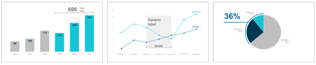
Highlight Data with a Pop of Color
Draw attention to your data by using color highlights on the most important pieces of information. Use neutral colors for the rest of the chart.

Add Labels to Charts to Communicate What’s Important
Charts often include a lot of numbers and data, and it can be hard for a viewer to know where to look. To draw attention to the most important points, call out statistics with labels or large type in addition to using a contrasting color.

Bundle with Brackets to Make Charts Easier to Read
Bracketing data on a chart shows the differences or summations of different elements by incorporating some math. This simple annotation helps connect data points and weave a story about how much data has changed or stayed constant.
Delineating Data Shows Short Falls and Surpluses
Adding a simple horizontal line to indicate a baseline turns a simple chart into a clear visualization of where benchmarks are being met and where they are not.

Dissect Data by Exploding it Out
To provide additional information on one data set, create a secondary element on the chart where you highlight subcategories with colors and graphics.

—
Five Annotation Strategies That Will Make Your Charts Stand Out. MIT Sloan. October 2020. https://sloanreview.mit.edu/wp-content/uploads/2020/10/73ecdbb100.pdf